
Breathing a new life into an aging e-commerce product
Product Design · Design System · Process Improvement
Introduction
In 2020, I led a very ambitious project to redesign an aging e-commerce product that was plagued with legacy issues and a slew of disparate features that made the experience inconsistent, buggy and complex to customize. Our goal was to redesign the product so that it’s modern, easy to customize, maintain and is easy to use for everyone, everywhere.
My Role
Design lead. Responsible for research, conceptualization, design, usability testing, delivery, process standardization and management
Team
5 designers, 2 Product Managers, 10+ enginners
Timeline
June 2022 — October 2021
To comply with my non-disclosure agreement, I have omitted and modified confidential information in this case study. All information in this case study is my own and does not necessarily reflect the views of Amdocs.
Impact
User adoption grew over 10x and support calls reduced by over 14%. We were also able to reduce the task completion time of key tasks by 74% and cart abandonment rate by 45%.


Desktop
Tablet
Mobile
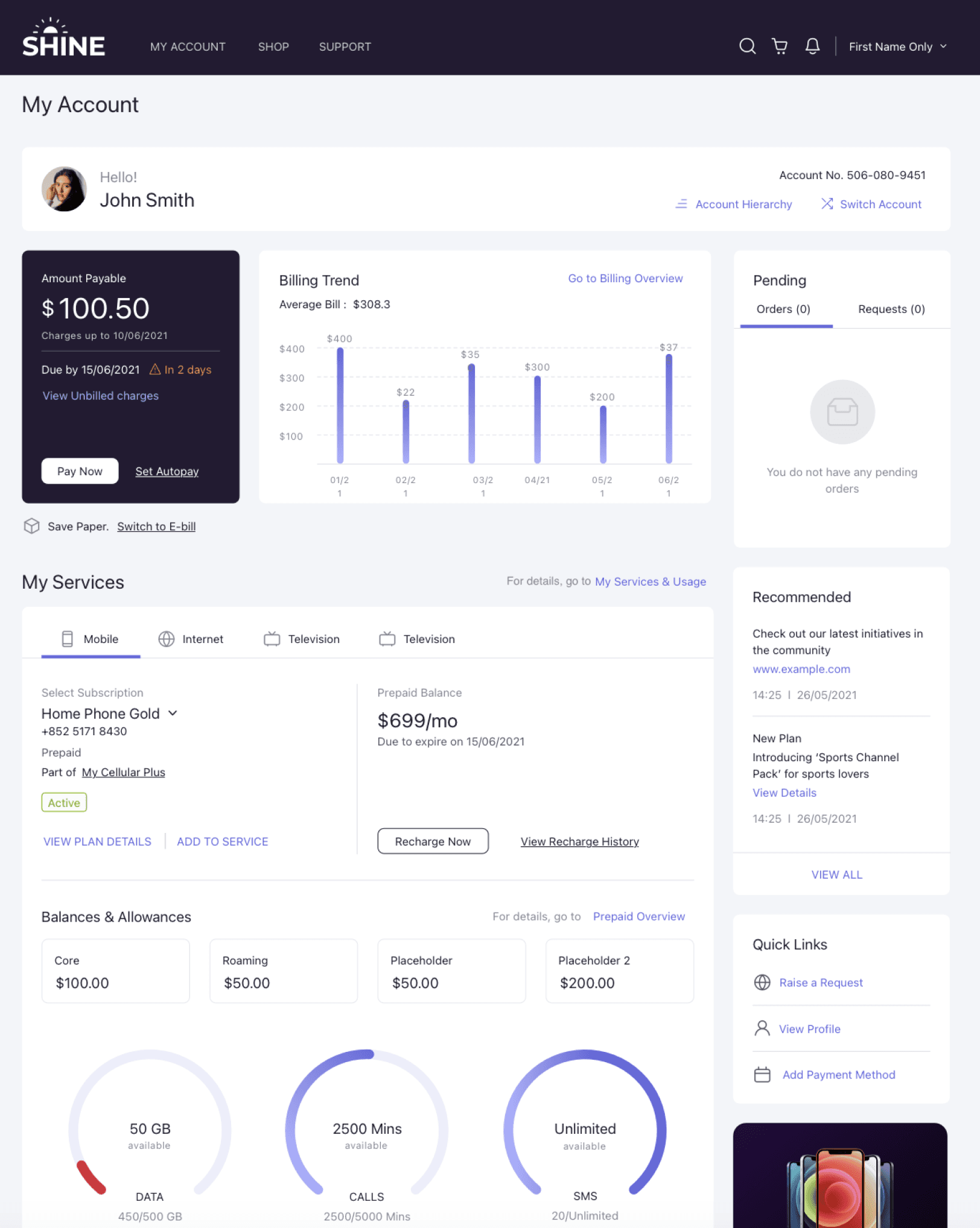
Redesigned account summary page
Since 2014, the product had been through many transformation in what it was supposed to do. It began as a product designed for toll operators, then to a billing product for telecom operators and then finally to being a core product for telecom users to manage their accounts online. How might we redesign the product so that its fast, delightful and uncomplicated to use, while making it easy to customize for any brand.
By 2020, the product had struggled to scale. Fundamental usability was challenged. Features were added without considering the overall impact on user flow and multiple elements competed for focus. Due to multiple transformations over the years the app did not deliver the expected user experience of its current goal. The reliability and performance issues increased exponentially while customizing the app as per customers branding and custom uses cases was a nightmare. We had reached a tipping point!
Problem Statement
The Journey
An uphill task
We began the process with a comprehensive review of our current product. To gain a deeper understanding of the challenges, we engaged with users, internal stakeholders, and engineers. These conversations provided invaluable insights, revealing numerous pain points.
It quickly became clear that we needed a two-pronged approach. 1 - Redesign the product to address usability and experience issues and 2 - Overhaul the development process to prevent recurring pitfalls and ensure long-term success.
Part One - Product
The key Pain Points
🙈 Users could not find filters
Users were frustrated that they were not able to quickly find the filters. The users that did manage to find the filters, were later confused which filters were applied.

💰 The pricing info was obscured and the cart was confusing
Users did not feel confident moving forward in the checkout flow, as the information on price was misleading and the cart structure was extremely confusing.

🗔 Dashboard page was missing critical info
Users could not find key information like an overview of all the services they have, usage summary, bill trends and service requests.

📱No support for mobile devices
Users complained that it was almost impossible to use the product on a mobile device.
🏃 High abandon rate during purchase
Users felt that the purchase flow was too long or the steps were not clear or sometimes the required information to make an informed decision was missing. This was resulting an abandonment rate of 26%.
26%
🧭 Navigation was not apparent
User were confused using the main navigations. It was hard to understand which category contained the item they were looking for.

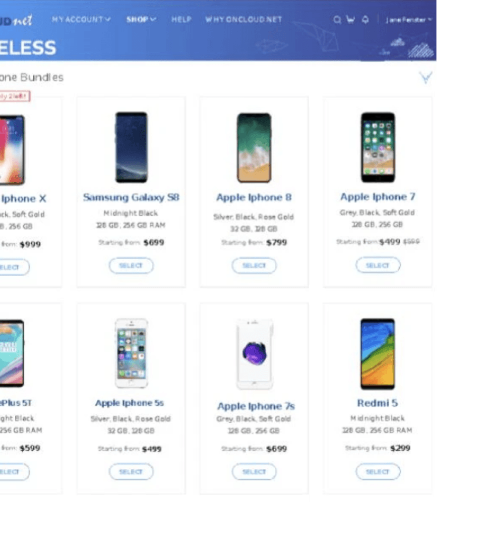
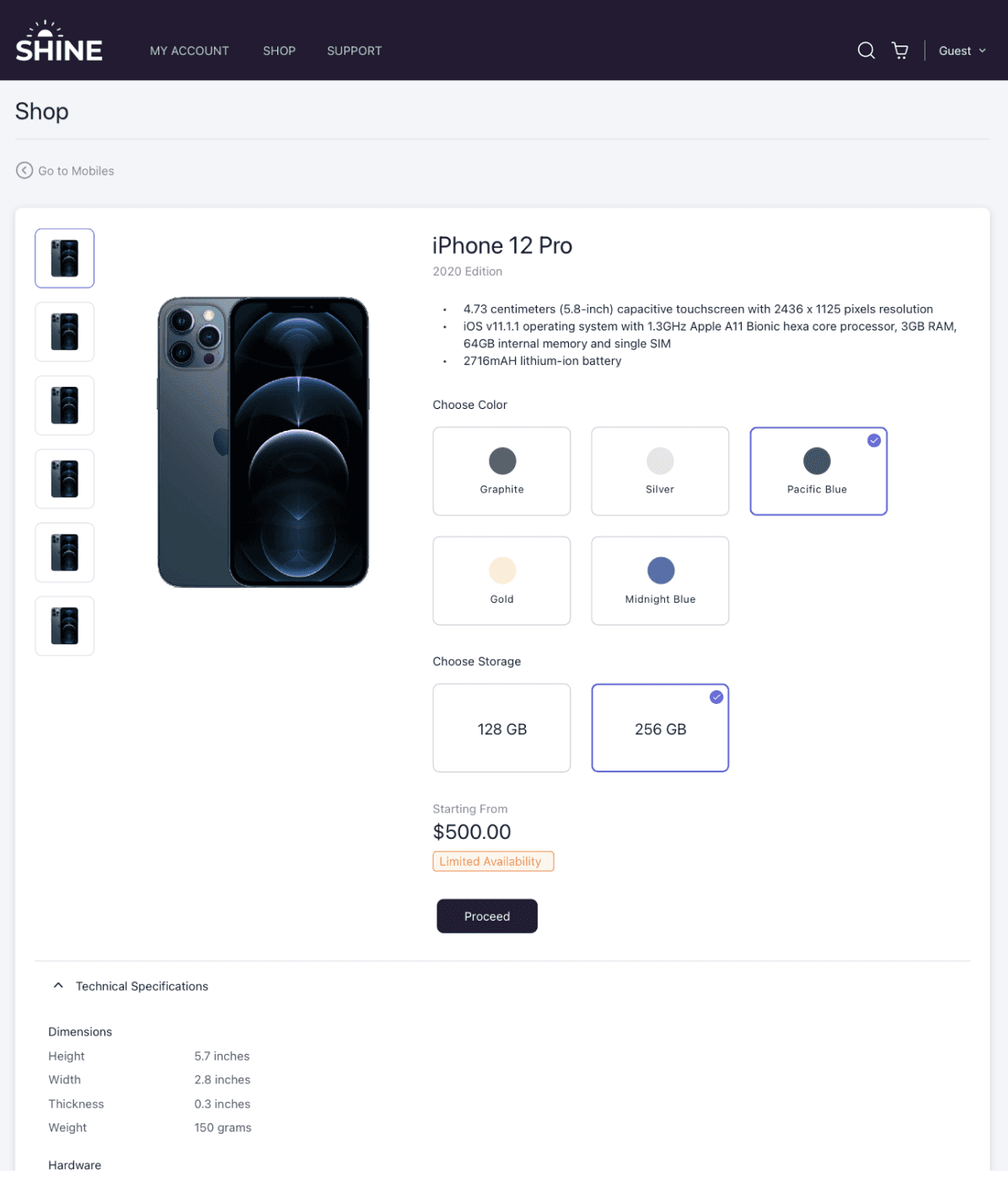
Based on the initial insights and benchmarking we started mapping the user journeys, flows and sketched out the wireframes for the key flows.
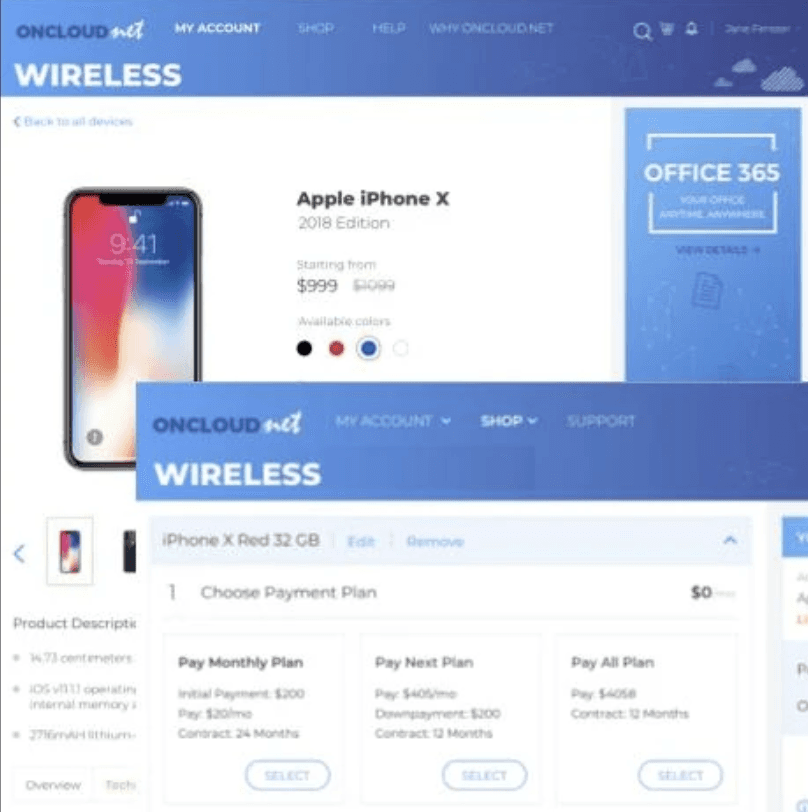
Due to confidentiality agreements, I have shown here a single modified wireframe as an example.
Process
Sorting user painpoints into diffrent stages of the user journey
We mapped out all the identified user pain points with the stages of user journey. This helped us identify opportunities at each stage.
Process

The New Account Summary experience

Final Result (highlights)
Solution

Easy to use filters that are upfront
and persistent
Users were frustrated that they were not able to quickly find the filters. The users that did manage to find the filters, were later confused which filters were applied.
We updated the filters to follow a modern UX paradigm that aligns with the users mental model while browsing similar websites. Filters were now upfront, bucketed into quick and advanced filters and it was easy to identify which filters are applied.
Highlight
Problem
Solution


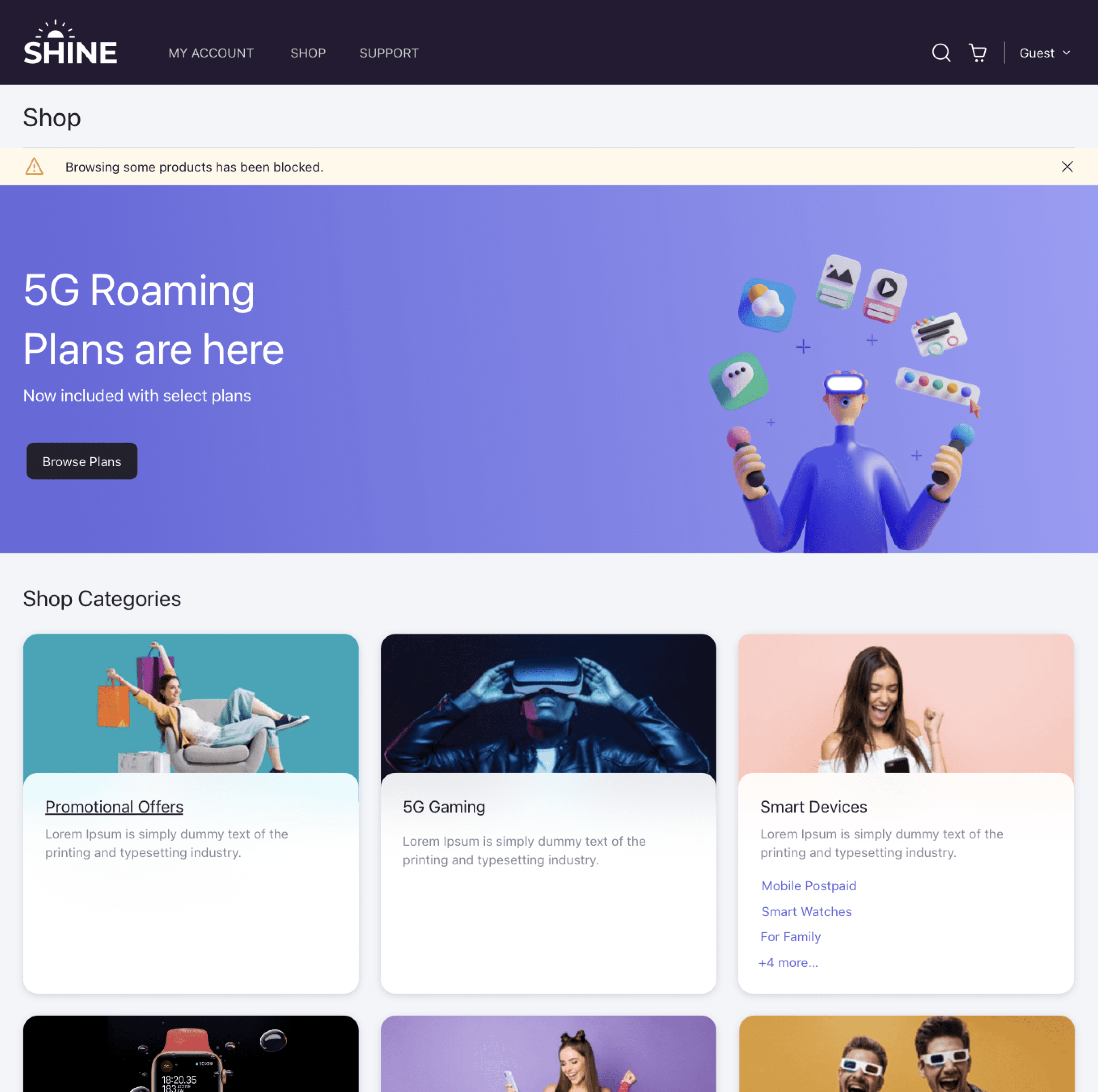
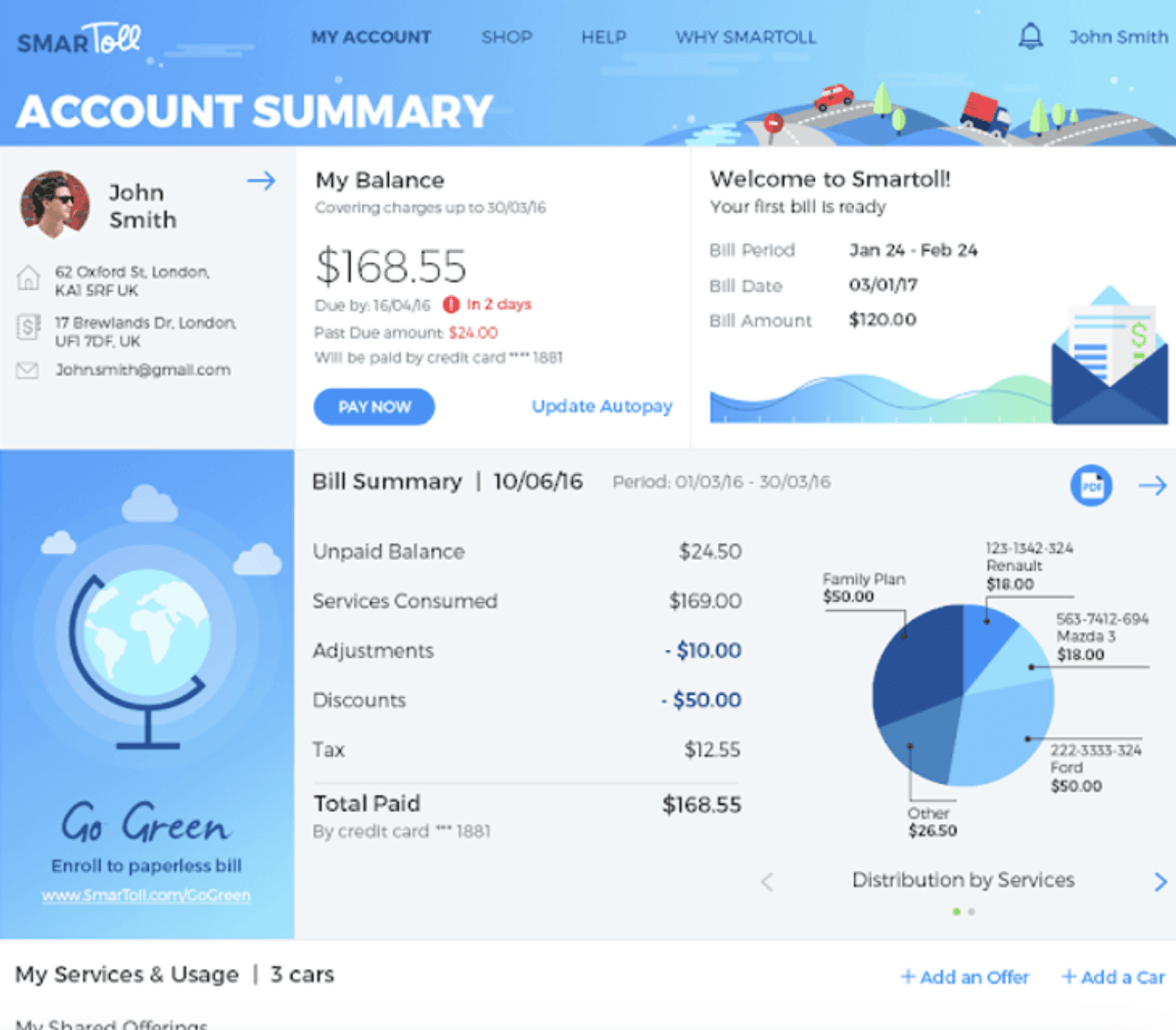
Dashboard page that surfaces key information and pending actions
Users could not find key information like an overview of all the services they have, usage summary, bill trends and service requests.
The updated account summary page presents key information such as the next payment due, bill trends, balances, and allowances, providing users with a clear, high-level overview of their engagement with the telecom operator.
Highlight
Problem
Solution


Transparent pricing information at each step and selection
Users did not feel confident moving forward in the checkout flow, as the information on price was misleading and the cart structure was extremely confusing.
The redesigned dynamic cart is more structured and transparently displays the final price the user needs to pay at checkout and on a recurring monthly basis. At each step, the user's selections are clearly highlighted, instantly reflecting their impact on the total amount due.
Highlight
Problem
Solution


Updated checkout flow helped reduce the cart abandonment rate by 45%
Users felt that the purchase flow was too long or the steps were not clear or sometimes the required information to make an informed decision was missing. This was resulting an abandonment rate of 26%.
We streamlined the purchase flow by consolidating steps, adding a progress indicator, and displaying key information upfront. Forms were optimized with auto-fill and error validation, and a "Auto Save & Resume" feature was added. A/B testing ensures a faster, clearer, and more user-friendly experience.
Highlight
Problem
Solution
Impact
10x
Increased user adoption
14%
Reduction in support calls
74%
Reduced task completion time
45%
Reduced cart abandonment
Part Two - Process
Fixing the process
While redesigning the product, we also analyzed the existing process to identify issues, avoid recurring pitfalls, and ensure long-term success.
1
There was no single source of truth
Users were frustrated that they were not able to quickly find the filters. The users that could find the options were later confused which filters were applied.
2
Developers and designers worked in silos
Users were frustrated that they were not able to quickly find the filters. The users that could find the options were later confused which filters were applied.
3
PM’s did not engage designers early
Users were frustrated that they were not able to quickly find the filters. The users that could find the options were later confused which filters were applied.
4
There was no usability
testing
Users were frustrated that they were not able to quickly find the filters. The users that could find the options were later confused which filters were applied.
5
Designers worked in an unstuctured way
Users were frustrated that they were not able to quickly find the filters. The users that could find the options were later confused which filters were applied.
The new process
Based on IBM’s enterprise design thinking methodology, I created a new process with clear outcomes for each stage and also designed roles and responsibilities. This really helped us bring efficiency to the entire process and ensured that everyone had a clear understanding of the ownership.

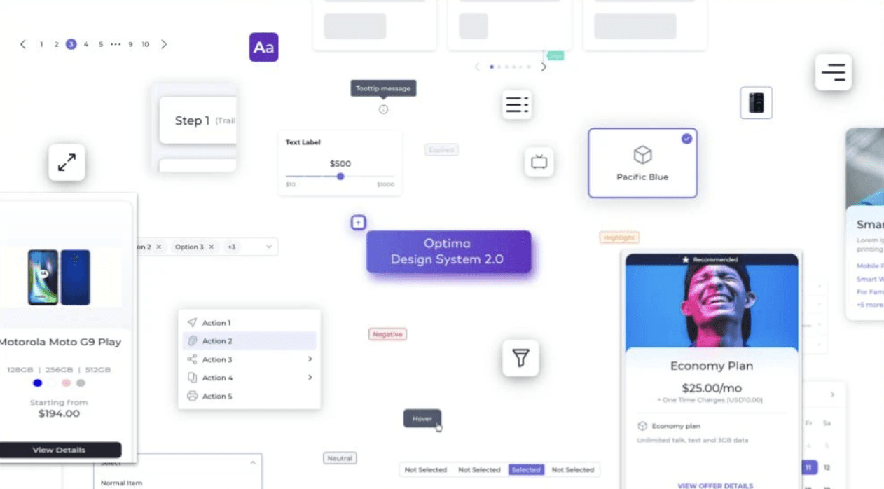
The design system
I had created and maintained design systems before, but this time I really wanted to go big and truly prove the value of a good design system. My goal was to create a system that is complete, flexible and easy to understand and maintain. I am so proud of the work I put in for this and the end result I achieved, that I thought it deserved to have its own case study.
View Case Study
Self Reflection
After working on the project for almost a year, I really started getting frustrated with the recurring issues in the product, the inability to make impactful value additions and just watching the process break down every other week.
I tried pushing small changed through, but they didn’t ever role up to making any big impact towards fixing the core issues. I tried to have several meetings with higher management to get approvals on stating a redesign.
Finally, I realized that If I want to get it done, I will have to just go ahead and do it. This is when I just went ahead and did some user interviews and spoke with many designers, developers and PM’s. This help me create the initial pitch for the project which included product gap analysis, process issues and the cost impact of continuing without fixing the issues.
This activity was a huge success as after the presentation, we finally got a go ahead to execute one of the biggest redesign project in the company.
If you want something done,
go do.
Documentation is king
Three years before I joined, we had designers, product managers, developers all working on the product and they did a good job taking the product from zero to one, but as there was no documentation in any form - design system, process guidelines, usage patters, page templates the product was failing ot scale.
What I did mainly throughout the process is to pay a great deal of attention to documentation. Everything we did had to be documented in some form or the other. This really helped bring the entire team on the same page. We all spoke the same language and were able to make decisions seamlessly.
UP NEXT